您现在的位置是:首页 >技术教程 >『Vue组件』Web Components 原生组件化网站首页技术教程
『Vue组件』Web Components 原生组件化
在学习Vue插槽(Slots)之前,我们可以先对Web Components的概念进行一个了解。因为Vue的模板系统,组件实现以及插槽相关的实现是参考于Web Components标准进行的上层设计。
在Vue中通过自定义组件、自定义标签以及自定义属性配合使用实现了Vue的组件化,是通过webpack/vite等工程化工具编译过后才能在浏览器上进行解析、渲染。
而对于HTML/DOM本身是具有一套组件化写法(规范),也就是本文的重点:Web Component,通过HTML/DOM本身的组件化,我们可以直接通过自定义标签、属性成功渲染,而不需要工程化解析组件或标签。
一、缘起
Web Components 旨在解决这些问题 — 它由三项主要技术组成,它们可以一起使用来创建封装功能的定制元素,可以在你喜欢的任何地方重用,不必担心代码冲突。由于在HTML/DOM中重用HTML结构的不便,推出了Web Components规范,最终成为HTML/DOM原生组件化的标准。
希望该方案提供给开发者能够自定义可重用的、可被浏览器正常解析的标签,让逻辑样式被封装在一个组件中,最终使用自定标签的方式渲染。
二、使用
在原生组件化中有这么三个关键的内容(具体内容见上文Web Components MDN):
- Html Template(HTML模板): <template> 和 <slot> 元素使您可以编写不在呈现页面中显示的标记模板。然后它们可以作为自定义元素结构的基础被多次重用。
- customElement(自定义元素):一组 JavaScript API,允许您定义 custom elements 及其行为,然后可以在您的用户界面中按照需要使用它们。
- shadowDom(影子DOM):一组 JavaScript API,用于将封装的“影子”DOM 树附加到元素(与主文档 DOM 分开呈现)并控制其关联的功能。通过这种方式,您可以保持元素的功能私有,这样它们就可以被脚本化和样式化,而不用担心与文档的其他部分发生冲突。
1. 方法介绍
- customElements.define():方法用来注册一个 custom element,该方法接受以下参数:
// 以下通过hello-word自定义标签示范define方法的使用
// 元素行为类需要继承于HTML元素类,可以是父类HTMLElement,也可以是子类如HTMLParagraphElement
class HelloWord extends HTMLElement {
  constructor() {
    // 需要调用父类的构造器, 此处的this指向的是html中的自定义标签元素
    super();
  }
}
- Element.attachShadow():方法给指定的元素挂载一个 Shadow DOM,并且返回对 ShadowRoot 的引用。
2. 用户信息Demo
场景:我们希望在多个页面上使用到用户信息的展示,考虑到代码的重复性、可维护性等综合因素,决定使用原生组件化来实现用户信息展示的组件。
方案:通过使用customElements.define定义自定义组件、属性以及通过元素行为类中的创建DOM元素方法创建对应的组件,最后在页面中使用自定义标签的方式渲染对应的用户信息组件。
- 在页面上配置自定义标签及属性,类似于Vue中组件的写法:
<user-info
  name="Donpe1"
  avatar="https://avatars.githubusercontent.com/u/1004691?v=4"
  age="22"
  occupation="student"
  >
  Web Components Information
</user-info>
但仅仅是在HTML中使用自定义标签是无效的,新版的Google浏览器中会将自定义标签认作为未知HTML标签并按照HTML元素的解析流程解析其内容及子元素。也就是说,在页面上当前仅只显示元素内容Web Components Information。
- 配置UserInfo行为类,为UserInfo行为类配置构造函数、创建元素的方法:
class UserInfo extends HTMLElement {
  constructor() {
    super();
    this.name = this.getAttribute('name');
    this.avatar = this.getAttribute('avatar');
    this.age = this.getAttribute('age');
    this.occupation = this.getAttribute('occupation');
    this.information = this.textContent;
    this.init();
  }

  init () {
    const shadowRoot = this.attachShadow({ mode: 'open' });
    shadowRoot.appendChild(this.createDom());
  }

  /**
         * @description: createDom 实例化组件DOM
         */
  createDom() {
    const oContainer = this.createContainer();
    oContainer.appendChild(this.createName());
    oContainer.appendChild(this.createAvatar());
    oContainer.appendChild(this.createAge());
    oContainer.appendChild(this.createOccupation());
    oContainer.appendChild(this.createContent());
    return oContainer;
  }

  createContainer() {
    const oContainer = document.createElement('div');
    oContainer.className = 'user-info-container';
    return oContainer;
  }

  createName() {
    const oName = document.createElement('p');
    oName.className = 'user-info-name';
    oName.textContent = `Name: ${this.name}`;
    return oName;
  }

  createAvatar() {
    const oAvatar = document.createElement('div');
    oAvatar.className = 'user-info-avatar';
    oAvatar.innerHTML = `<img style="width: 100px;" src="${this.avatar}" />`
    return oAvatar;
  }

  createAge() {
    const oAge = document.createElement('p');
    oAge.className = 'user-info-age';
    oAge.textContent = `Age: ${this.age}`;
    return oAge;
  }

  createOccupation() {
    const oOccupation = document.createElement('p');
    oOccupation.className = 'user-info-occupation';
    oOccupation.textContent = `Occupation: ${this.occupation}`;
    return oOccupation;
  }

  createContent() {
    const oContent = document.createElement('h1');
    oContent.className = 'user-info-content';
    oContent.textContent = this.information;
    return oContent;
  }
}
其中的重点并非是各个create函数,而是初始化函数中的attachShadow方法。因为我们需要将自定义的元素结构挂载至shadowRoot上。这么做的原因是封装、隔离Web组件的样式和功能,不会受到外部样式的污染。如果有需要,我们可以在元素行为类中给shadowRoot添加style标签,在其中填写组件内部需要隔离的样式:
const style = document.createElement('style');
style.textContent = `
  button {
    background-color: blue;
    color: white;
    padding: 10px 20px;
    border: none;
    border-radius: 5px;
  }
`;

// 将样式添加到Shadow DOM中
shadowRoot.appendChild(style);
当然,上述的创建元素方法可以通过ES6中的模板字符串(字面量)进行替换,这里不做演示。做完上述的元素行为类的编写,还需要对其进行注册。
- 注册自定义组件
这里便需要使用到上述提到的customElements.define方法对自定义的标签进行注册:
window.customElements.define('user-info', UserInfo);
- 效果图
当完成了上述三个步骤后我们便完成了UserInfo组件的注册,也就能得到目标效果:

同时,通过控制台的结构我们可以清晰的看到其中的shadowRoot对组件结构与DOM进行了隔离,如下:
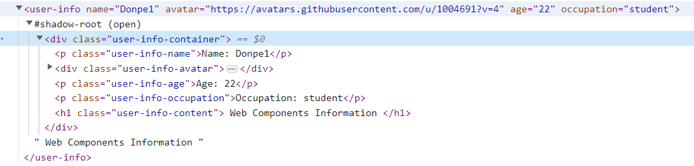
在控制台结构中仍然是以自定义标签的形式进行展现,不同的是多了shadow-root这一元素,并且在其中存放着页面真实展示的结构。
3. template、slot使用
在原生组件开发中同样还有另外一种写法,也就是Template与Slot配合的写法,这种写法非常类似于Vue中的插槽写法。不知道大家是否使用过script作为模板进行模板替换的复用开发经历,这种写法就是在此基础上使用slot标签进行占位。对该标签进行组件注册之后,便能够在HTML结构中进行复用。
- template模板编写
<template id="my-article-template">
  <style>
    h1 {
      color: red;
    }

    h1 .author,
    h1 .date-time {
      font-size: 16px;
      color: #666;
      font-weight: normal;
    }
  </style>
  <div class="my-article">
    <h1 class="my-article-title">
      <slot name="title" class="title"></slot>
      <slot name="author" class="author"></slot>
      <slot name="dateTime" class="date-time"></slot>
    </h1>
    <p class="my-article-content">
      <slot name="content"></slot>
    </p>
  </div>
</template>
- template组件注册
本质上与上一小节的元素添加至shadowRoot中是一样的,不过不同的是我们通过HTMLTemplateElement的content方法得到了一个DocumentFragment元素,并通过cloneNode的方式克隆之后追加至shadowRoot元素中。
至于为何要使用到cloneNode,是为了防止多个自定义标签共用相同的结构实例,也是避免某处的修改影响到多个组件,通过克隆使得各个Article组件都是相互独立的。
class MyArticle extends HTMLElement {
  constructor() {
    super();
    const _tpl = document.getElementById('my-article-template').content;
    const shadowRoot = this.attachShadow({ mode: 'open' });
    shadowRoot.appendChild(_tpl.cloneNode(true));
  }
}
window.customElements.define('my-article', MyArticle)
- 自定义组件的使用
<my-article>
  <p slot="title">This is my Title</p>
  <span slot="author">Donpe1</span>
  <span slot="dateTime"> - 2023-01-04 16:07:48</span>
  <p slot="content">This is my Content</p>
</my-article>
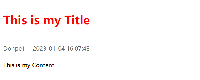
- 效果图:
可以从效果图中发现,不仅是Slot插槽成功渲染了,并且样式也得到了渲染。有兴趣的朋友可以自行验证shadowRoot对于组件样式与外界样式的隔离。
三、总结
本文从Web Components的缘起入手,简单描述了Web Components以及其中关键的几个方法。并且通过两个Demo案例演示了原生组件化应该如何编写,以及原生组件化中的template、slot机制。同时对于shadowDom、shadowRoot大家应该也有了简单的认知,更多相关的内容在后续有机会会与大家分享。
对于Web Components并不是必须掌握的内容,毕竟很难落地,不过并不代表可以不知道它的存在。同时知道了原生组件化的开发,也将对我们学习Vue组件化开发、Vue插槽机制起到一定的帮助。


站长推荐
- QT多线程的5种用法,通过使用线程解决UI主界面的耗时操作代码,防止界面卡死。
 QT多线程的5种用法,通过使用线程解决UI主界面的耗时操作代码,防止界面卡死。...
 - U8W/U8W-Mini使用与常见问题解决
 U8W/U8W-Mini使用与常见问题解决
 - stm32使用HAL库配置串口中断收发数据(保姆级教程)
 stm32使用HAL库配置串口中断收发数据(保姆级教程)
 - 分享几个国内免费的ChatGPT镜像网址(亲测有效)
 分享几个国内免费的ChatGPT镜像网址(亲测有效)
 - Allegro16.6差分等长设置及走线总结
 Allegro16.6差分等长设置及走线总结